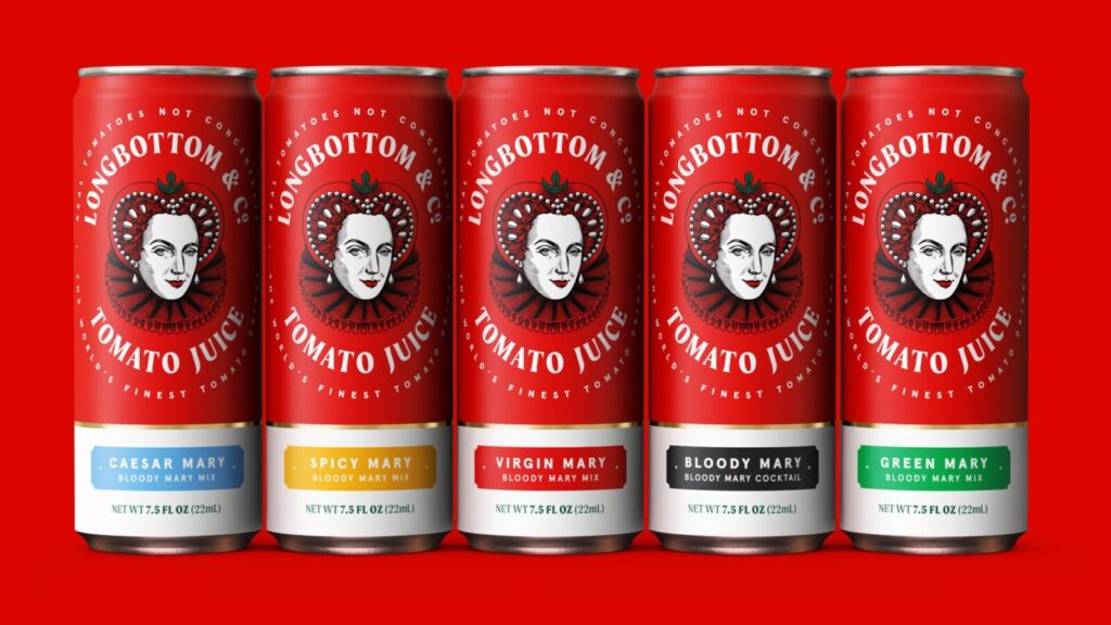
amynicole – Longbottom & Co. has built a strong reputation in the tomato juice category by prioritizing quality and using all-natural ingredients. Despite this commitment, its previous visual identity did not reflect its premium status, often resembling a generic store-brand product. To address this, creative agency Derek&Eric reimagined the brand, creating a fresh identity that blends British heritage with modern playfulness.
At the heart of the rebrand is the concept of “Playfully Proper,” a positioning that balances craftsmanship with lighthearted sophistication. This idea is best represented by the new Queen Mary mascot, who wears a Tudor-inspired tomato headdress. Her confident smirk and expressive eyes add a regal yet approachable charm, making her a standout brand figure.
“The goal was to align the brand’s look with the exceptional quality of its product,” said Derek&Eric managing director Jon Gibbs. “We introduced a bold, character-driven approach that merges tradition with a witty, modern edge.”
This balance is further reinforced through refined typography, a carefully crafted roundel, and a vibrant color palette inspired by freshly pressed tomatoes. The new design ensures strong shelf appeal while preserving the brand’s rich heritage. By blending sophistication with a touch of fun, Longbottom & Co. now stands out as a premium product with a distinctive identity.
Longbottom & Co Reinvents Its Brand with a Bold and Playful Identity
Longbottom & Co. has introduced a striking new visual identity, placing Queen Mary at the heart of its brand. This bold decision gives the company an instantly recognizable character, setting it apart in the competitive tomato juice market. The design team explored multiple iterations before finalizing a version that balances historical inspiration with modern charm.
Initially, the early designs leaned heavily on historical accuracy, but the team found them lacking in approachability. Through refinements, they developed a stylized version of Queen Mary that conveys both regal authority and a playful personality. This balance of sophistication and wit extends throughout the brand’s typography and packaging, reinforcing its premium positioning while maintaining a contemporary appeal.
Read More : New Antibodies Offer Hope Against All SARS-CoV-2 Variants
Vibrant and Adaptable Brand Identity
Color played a key role in the redesign, with a palette inspired by the natural vibrancy of tomatoes. Rich reds, deep crimsons, and golden hues evoke freshness and appetite appeal while adding a regal touch. These bold tones contrast with muted, premium shades, ensuring the packaging feels both lively and refined.
Beyond packaging, the new identity seamlessly extends across digital and in-store experiences. The Queen Mary mascot and typography feature prominently in online ads, social media, and the brand’s website, ensuring a consistent and engaging presence. The redesign positions Longbottom & Co. as a standout brand that successfully merges tradition with modern sophistication.
Longbottom & Co Strikes a Bold Balance Between Tradition and Modernity
Derek&Eric faced a significant challenge in redefining Longbottom & Co.’s identity—finding the perfect balance between heritage and modernity. The risk of the brand feeling either too outdated or too irreverent was high. To address this, the design team meticulously refined the Queen Mary mascot, typography, and color palette through multiple iterations and testing.
Ensuring consistency across different packaging formats was another key priority. The team developed a flexible yet cohesive design system, allowing the brand to maintain its identity across various product lines and marketing materials. This adaptability strengthens Longbottom & Co.’s presence in both digital and physical spaces.
Distinctive Presence in a Competitive Market
The response to the rebrand has been overwhelmingly positive. Longbottom & Co. now stands out as a premium brand with a strong, character-driven aesthetic. While official market impact data is still forthcoming, the industry has already taken notice of its refreshed presence.
“Many premium brands lean too much on tradition and feel stagnant, while others focus solely on modern minimalism and lose their character,” says Jon Gibbs, managing director at Derek&Eric. “Longbottom & Co. strikes the perfect balance—rooted in British history yet refreshingly playful.”
By embracing a bold yet refined identity, Longbottom & Co. has evolved from a visually unremarkable brand into a standout leader in its category. With a playful yet proper aesthetic, it now confidently claims its place among the most iconic beverage brands.