amynicole – Korean Air has revealed a refreshed brand identity—its first in four decades—as it positions itself as a leading global carrier. Designed by renowned consultancy Lippincott, the rebrand introduces a modernized Taeguk emblem and logotype, signifying the airline’s evolution from national icon to international flagship. The redesigned Taeguk, drawn from the South Korean flag, now features a fluid form inspired by Sangmo Nori, a traditional Korean dance characterized by swirling ribbons.
For the first time, the emblem stands alone, separate from the wordmark, thereby reinforcing Korean Air’s distinct identity on the global stage. Consequently, this refined symbol will appear across the airline’s aircraft livery, digital platforms, and customer touchpoints. Looking ahead, Korean Air plans to debut the new branding in March 2025, coinciding with its post-merger integration with Asiana Airlines and signaling the beginning of a new chapter in its journey toward international leadership
Lippincott Balances Heritage and Modernity in Visual Overhaul
Lippincott faced the task of evolving Korean Air’s deeply rooted identity without losing its national heritage. The design team introduced a more contemporary look while preserving core visual elements. Dan Vasconcelos, partner at Lippincott, explained that the team selectively modernized some features while preserving others. The Taeguk and logotype were overhauled, while the aircraft livery received a subtle update with a metallic blue finish to retain its iconic look.
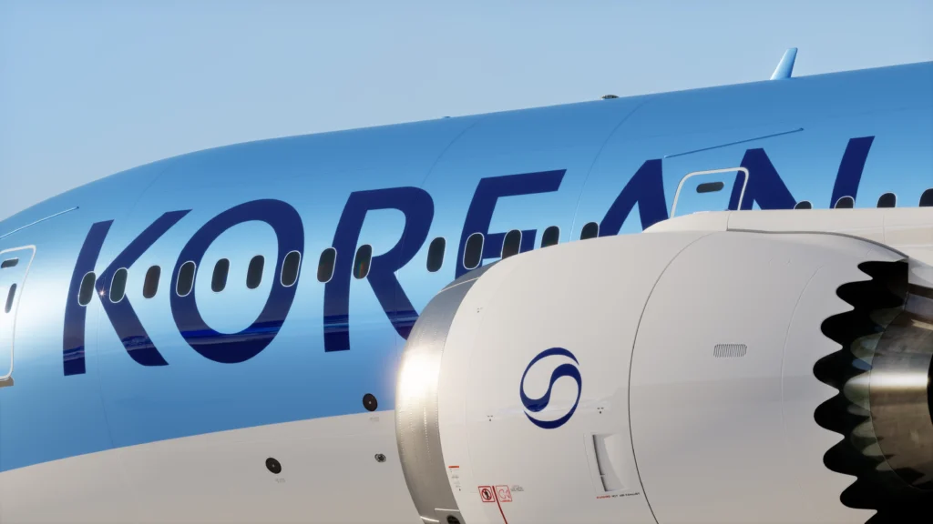
One of the most notable changes includes the new logotype, which draws inspiration from traditional Korean calligraphy. The letterforms were refined to express elegance and cultural authenticity. Korean Air also made the bold decision to drop the word “Air” from the fuselage, allowing “Korean” to stand on its own. This change strengthens brand visibility from airport terminals and affirms the airline’s role as South Korea’s leading global ambassador.
Read More : Scientists Achieve First Laser-Driven High-Res CT Scans
Korean Air Elevates Taeguk Symbol with Artistic Movement and Cultural Depth
Korean Air has reimagined its iconic Taeguk symbol, infusing it with cultural artistry and modern elegance. The new design draws inspiration from Sangmo Nori, a traditional Korean dance that uses ribboned hats to create sweeping, dynamic movements. These fluid forms now shape the airline’s emblem, symbolizing prosperity and continuity while evoking motion and grace.
Dan Vasconcelos of Lippincott explained the challenge clearly: to create a Taeguk that reflects Korean Air’s identity without losing national significance. To achieve this, the design team needed to balance cultural familiarity with distinctive ownership. As a result, the refreshed emblem stands out as immediately recognizable within the brand’s environment. Moreover, its ribbon-like aesthetic enhances visual appeal across both digital and physical spaces — from cabin interiors to boarding passes. By simplifying the design and removing excessive detailing. This refined symbol becomes a versatile and elegant marker of Korean pride and aviation excellence..
By aligning tradition with innovation, Korean Air’s updated Taeguk expresses elegance and movement, representing both the airline’s heritage and its bold step toward a global premium identity.
Premium Experience Redefined Through Design and Subtle Luxury
Korean Air’s rebrand extends far beyond a new logo. The airline now presents itself as a premium global carrier, offering an elevated travel experience at every touchpoint. In collaboration with PriestmanGoode, the airline redesigned its cabins with carefully curated materials and a modern color palette. Signature Korean blues remain central to the brand, while dark neutrals and bronze accents introduce warmth and sophistication. Especially in business and first-class settings.
Vasconcelos emphasized confidence as the cornerstone of premium design. Korean Air reduced logo placements to avoid visual clutter. Instead, the Taeguk now acts as a subtle signal of quality, woven into interiors and digital platforms with restraint and purpose.
This design philosophy also aligns with new service initiatives—enhanced dining experiences, partnerships with luxury brands, and curated amenities—aimed at creating a seamless and elegant journey for high-end travelers.
Korean Air Marks a Bold New Era with Rebrand and Global Ambitions
Korean Air has launched a sweeping rebrand at a pivotal moment in its history. Coinciding with its merger with Asiana Airlines. This transformation reflects the airline’s drive to assert itself as a top-tier global carrier while proudly representing South Korea on the international stage. The refreshed identity blends tradition with innovation, delivering a visual message of confidence, renewal, and national pride.
Lippincott partner Dan Vasconcelos, who led the rebrand, emphasized the strategic intent behind the overhaul. “Rebrands of this scale are deeply strategic — they signal transformation and invite reappraisal,” he said. Korean Air’s redesigned identity is grounded in visible improvements to its passenger experience. This includes upgraded cabins, refined services, and expanded international routes.
The rebrand is already turning heads, with newly liveried aircraft set to debut in March 2025. The bold update includes a modernized Taeguk emblem and an elegant, simplified logotype that now reads simply “Korean.” These changes align the brand more closely with global standards while reinforcing its unique cultural roots.
From Incheon to international hubs, Korean Air’s new look signals a confident leap into its next chapter — one that embraces heritage, elevates experience, and competes on a global stage.